Sketch Club: Diagrams
In the first part of our Sketch Club series, Leigh Maizels discusses the importance and relevance of the diagram to our craft as architects and their wider significance.
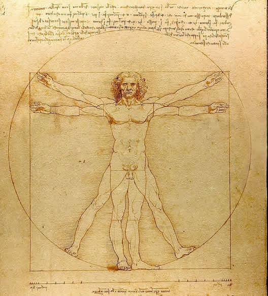

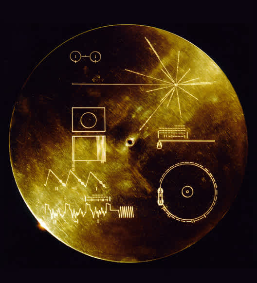
Diagrams are a fundamental tool for architects - and intrinsic to human communication. They have been used in various forms by each and every generation on earth. Even when we seek to communicate beyond our humanity, diagrams are how we choose to distil our ideas, advancements, and our civilisation into to their purest and simplest elements.
Simplicity and legibility
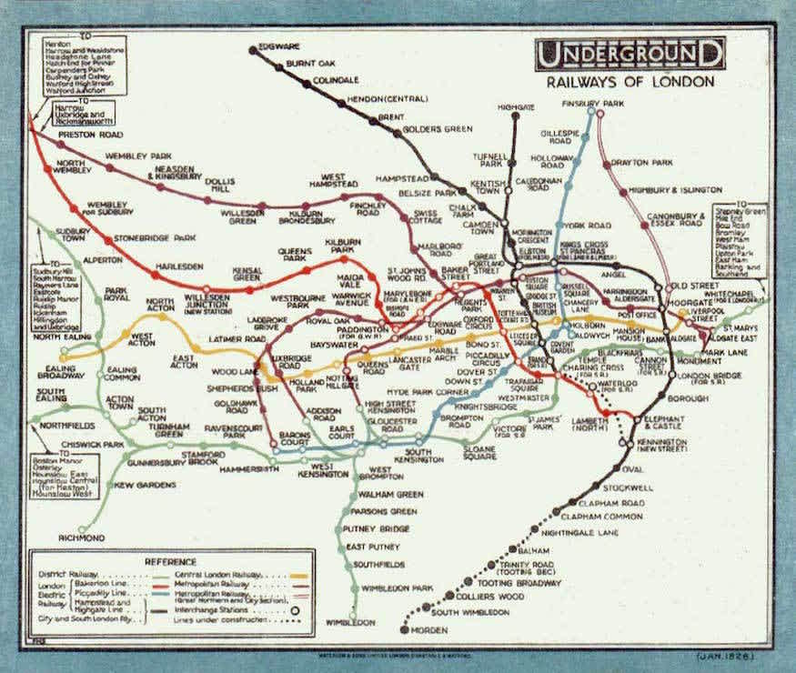
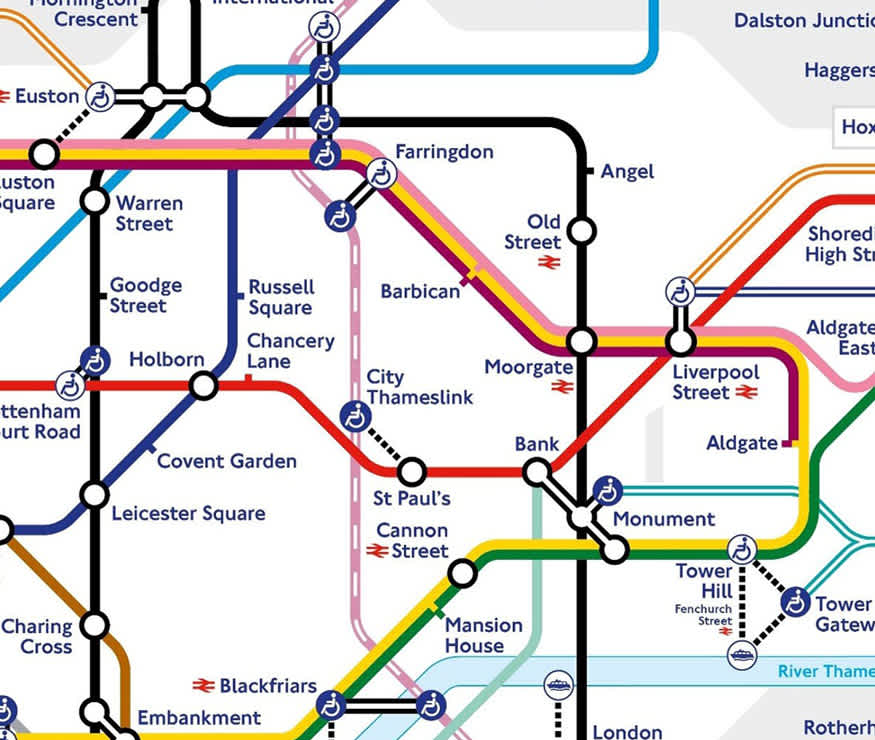
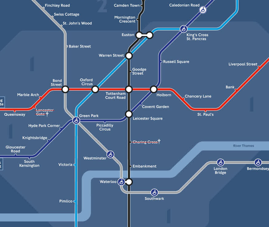
The best diagrams are unambiguous in what they convey. They are also surgically laid out and arranged, and highly selective in what information is included, so that nothing redundant is visible. The modern tube map is a masterwork of simplicity. It owes much of its evolution to the pioneering work of engineer Harry Beck, and presents a phenomenal amount of information in a simple readable form ( the fascinating history of the tube map can be found here ). The more recent night tube map brilliantly adapts an already iconic diagram to an even more reductive focus, displaying only what is needed. What these diagrams demonstrate is how the omission of certain information is necessary to a diagram’s success.
Diagrams in digital communication
The best diagrams are unrivalled in their efficiency at communicating information. They are also ubiquitous, and thoroughly woven into our everyday lives. Over recent decades, as communication has moved much more into the digital realm, the diagram as linguistic shorthand still maintains its relevance – not just in conveying factual information but also our thoughts, feelings, and emotions. Consider the diagram of a ‘thumbs up’ in the Microsoft Teams platform – it is a simple drawn outline accompanied by a graphic coloured ‘tick’ positioned on the border of the user’s initials to indicate they are online and available. Despite being a composition of extremely simple diagrammatic devices - and even if we remove the words - it manages to convey the a raft of subtle cues and important information such as:
- Jerome is working
- Jerome has read the message
- Jerome has understood the message and endorses the message's content
- We are aligned in purpose and expectations on this matter
- I may freely contact him as the green tick implies he is available to speak


Overcoming complexity
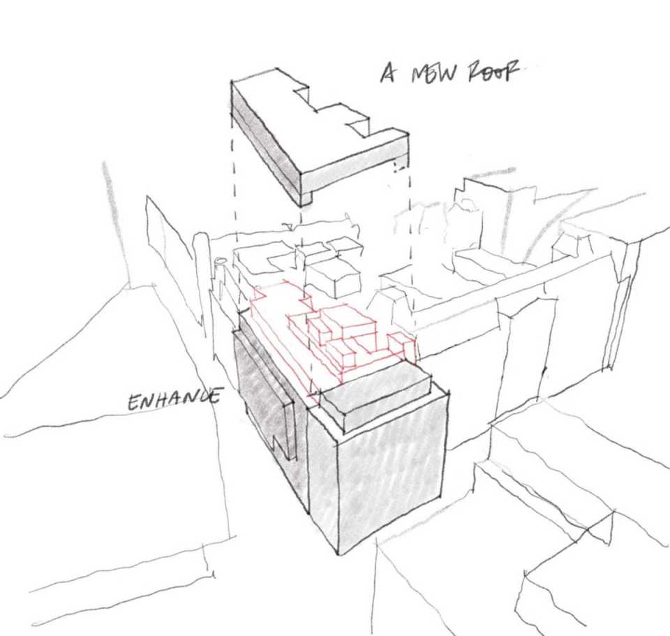
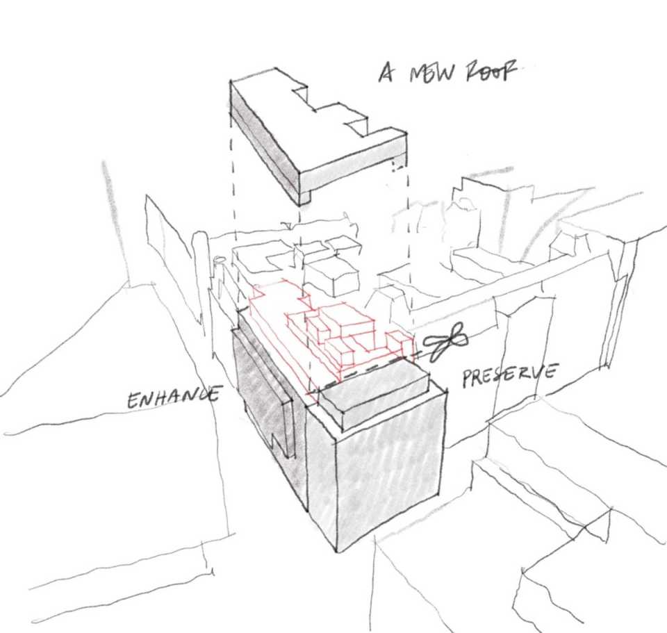
The diagram is intrinsic to our work as architects. Sketch perspectives are a wonderful way to think about architectural ideas within neighbourhoods. The diagrams below describe a complex refurbishment and retrofit project of a post-modern office block on a key corner site. The first diagram details all of the major structural alternations as part of the retrofit, but the second, through the addition of simple cartoon scissors describes the complex undertaking of the retention and preservation of the existing façade.
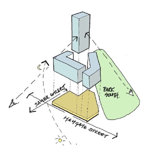
Diagrams can also help simplify the arrangement of architectural forms on a site, which can be complex and difficult to express in a single drawing. A simple sketch diagram with a 3D perspective, simple colouration, and cartoon icons (sun, moon and single eyes) can make the most relevant information easily readable. In this diagram of Park and Sayer, the sketch describes the orientation of the buildings on the site, simplifying the road names and surrounding park to street axes and a green-filled outline respectively. Only what is relevant is shown.
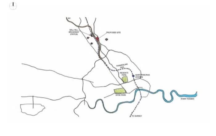
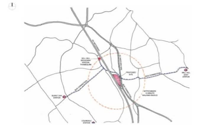
At city-scale, context plans can effectively employ the same principles of simplicity. In the first sketch, solid lines indicate roads, blue, the River Thames, green the parks, and dashed lines for key railways. - a red block indicates the site in question, and the surrounding contextual information is simplified so that we understand where the site sits within the city. At a more detailed neighbourhood scale, a second level of information is overlaid and the diagram scaled up from the previous view - but the principles remain the same.
Overlaid text and images
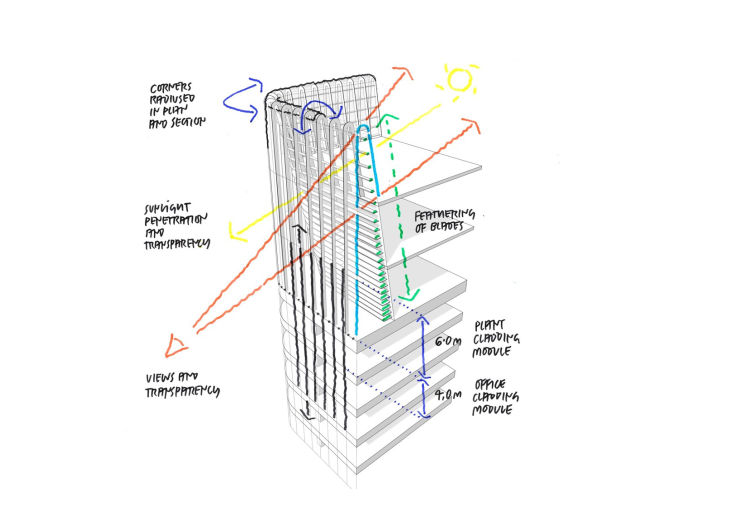
Overlaying diagrammatic information over more technical imagery can be extremely useful in distinguishing the important ideas. Note how in the diagram below, the freehand annotations are bold and legible and easy to distinguish from the computer generated linework, and how it is these that convey the meaningful information.
A diagram, or a diagram sequence dedicated to a single idea, can also be a powerful way of collating extensive information. In the sequence below complex site analysis is condensed into freehand gestures to turn the focus onto the one vital design concept.
Use of colour
When used thoughtfully and sparingly, colour can be a valuable tool in arranging complex information in an easy to read format. Renzo Picasso, Italian architect, engineer, urban planner and designer's illustrated diagrams exhibit a masterful use of colour to decode complex urban infrastructure. In his Piccadilly Circus illustration, the yellow tubes denote the tube tunnels, the grey-blue is for the station structure for the passengers to walk through, the iconic red buses and the precise and identifiable street-level landmark of the Eros in gold – identify the street-level. The subterranean point of view or perspective is an additional skilful touch, as it is the most beneficial aspect from which to understand the interlocking component parts of the station.
Diagramming a 'Busy Space'
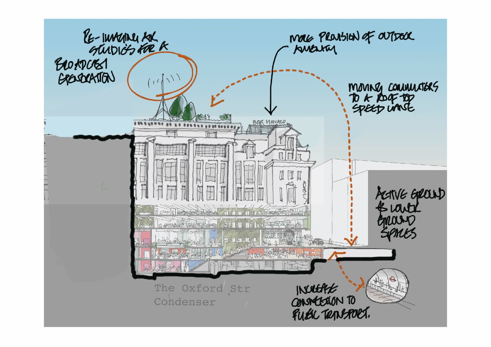
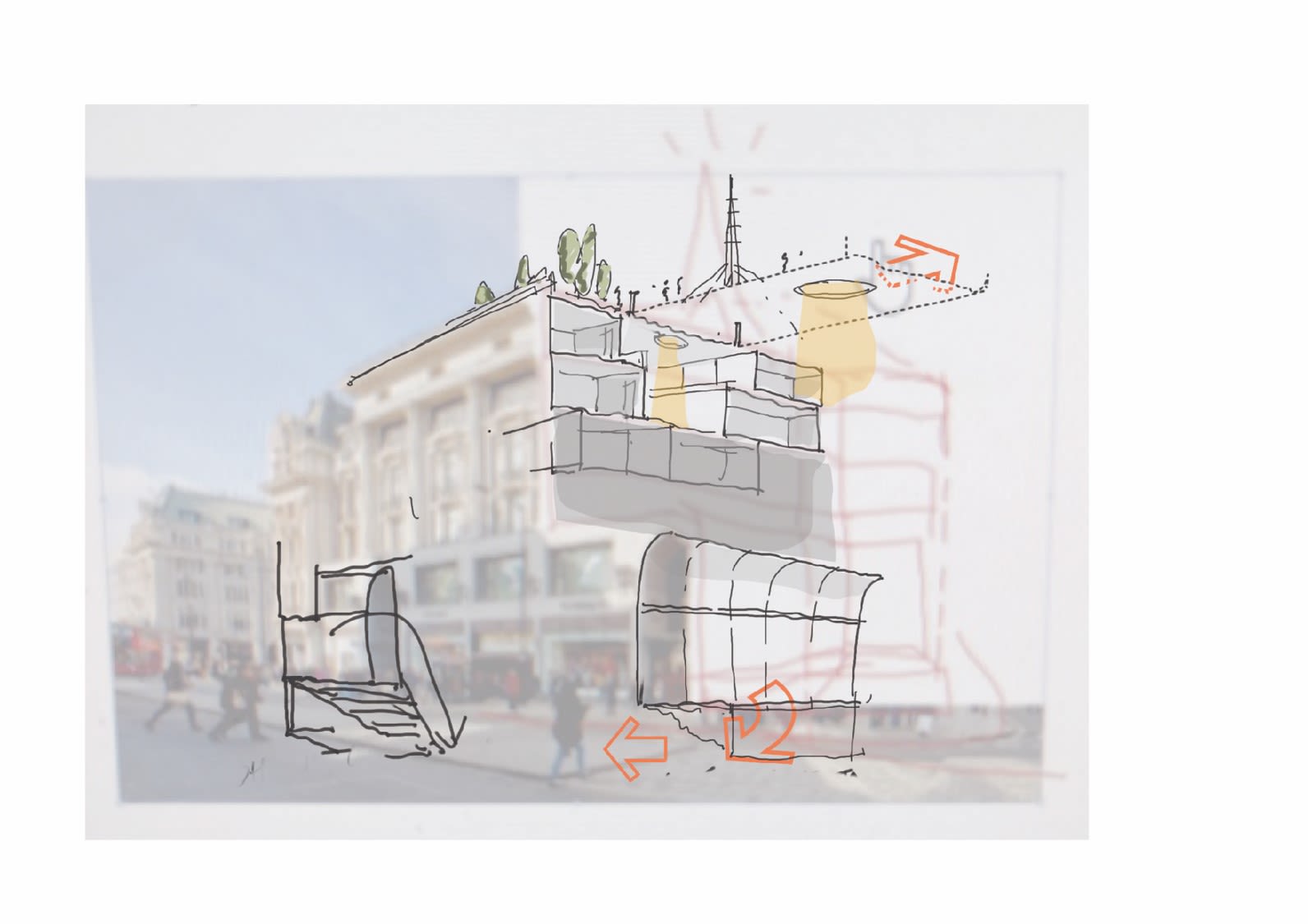
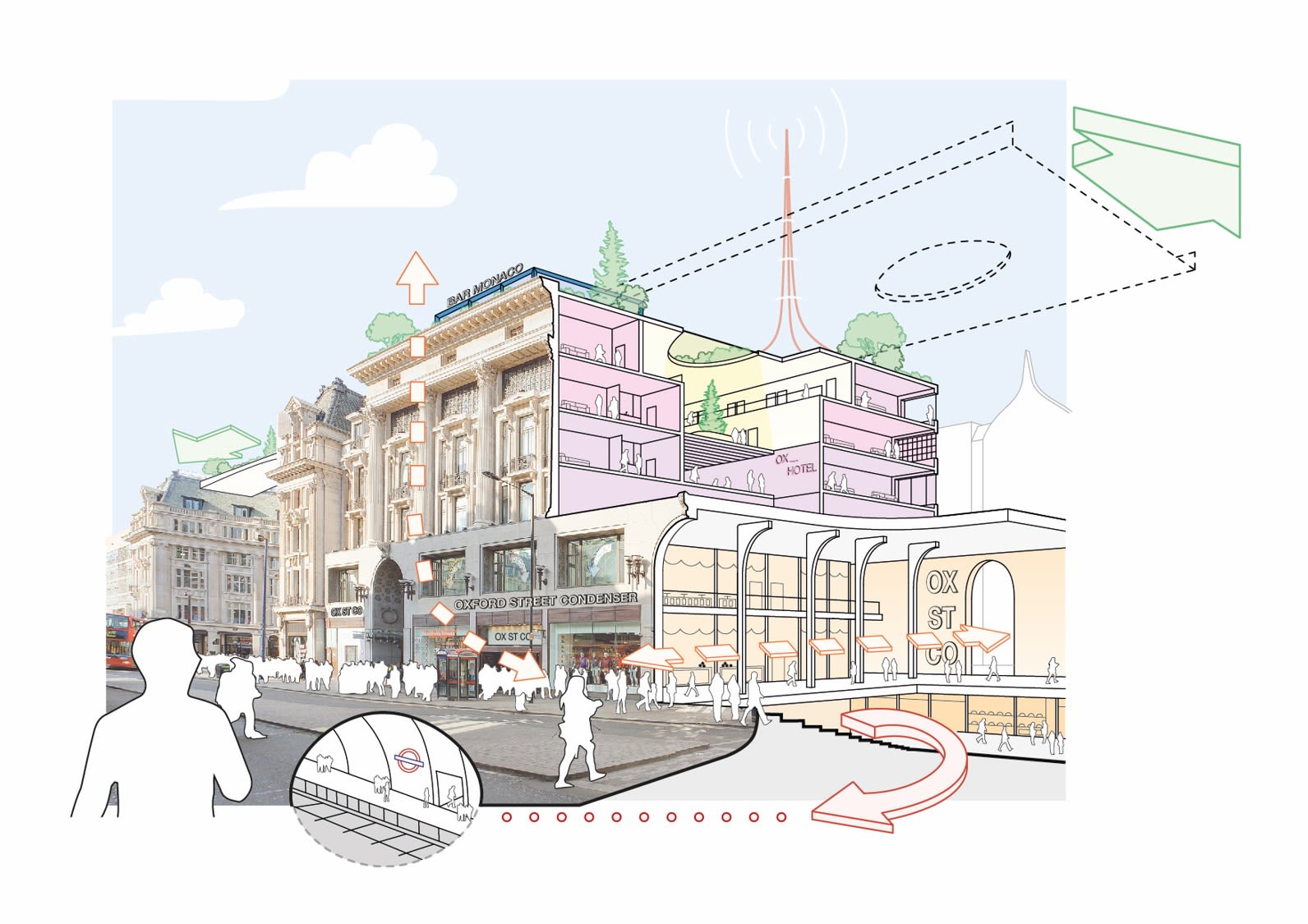
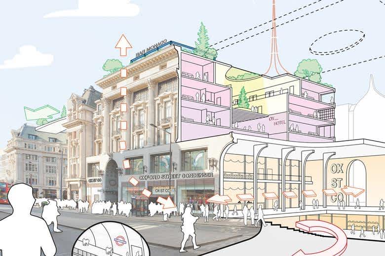
In a recent exercise for Property Week, AFK were invited to submit our ideas to transform the iconic former Topshop store on London's Oxford Street into a new destination . Our idea was to reinvent this Oxford Street staple into ‘busy space’ for the 21st century, blurring the boundaries between life, work and leisure and condensing these uses into a single hub. As with all diagrams, they rarely emerge fully formed - and are often used as a tool to develop and work through ideas. Diagrams will usually go through many rounds of revisions as the ideas crystallise, and the information that needs to be conveyed is simplified and boiled down to the key elements. For this exercise, it began with a first iteration that plays with perspective, different sketching styles and overlaying initial ideas over a cross section of the Topshop building...
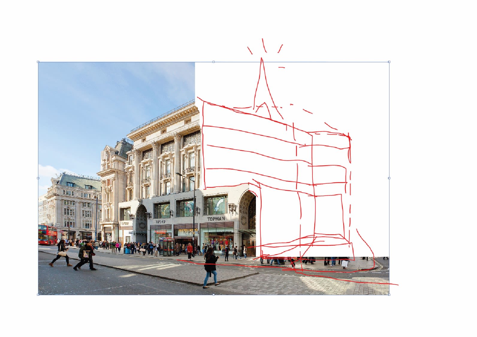
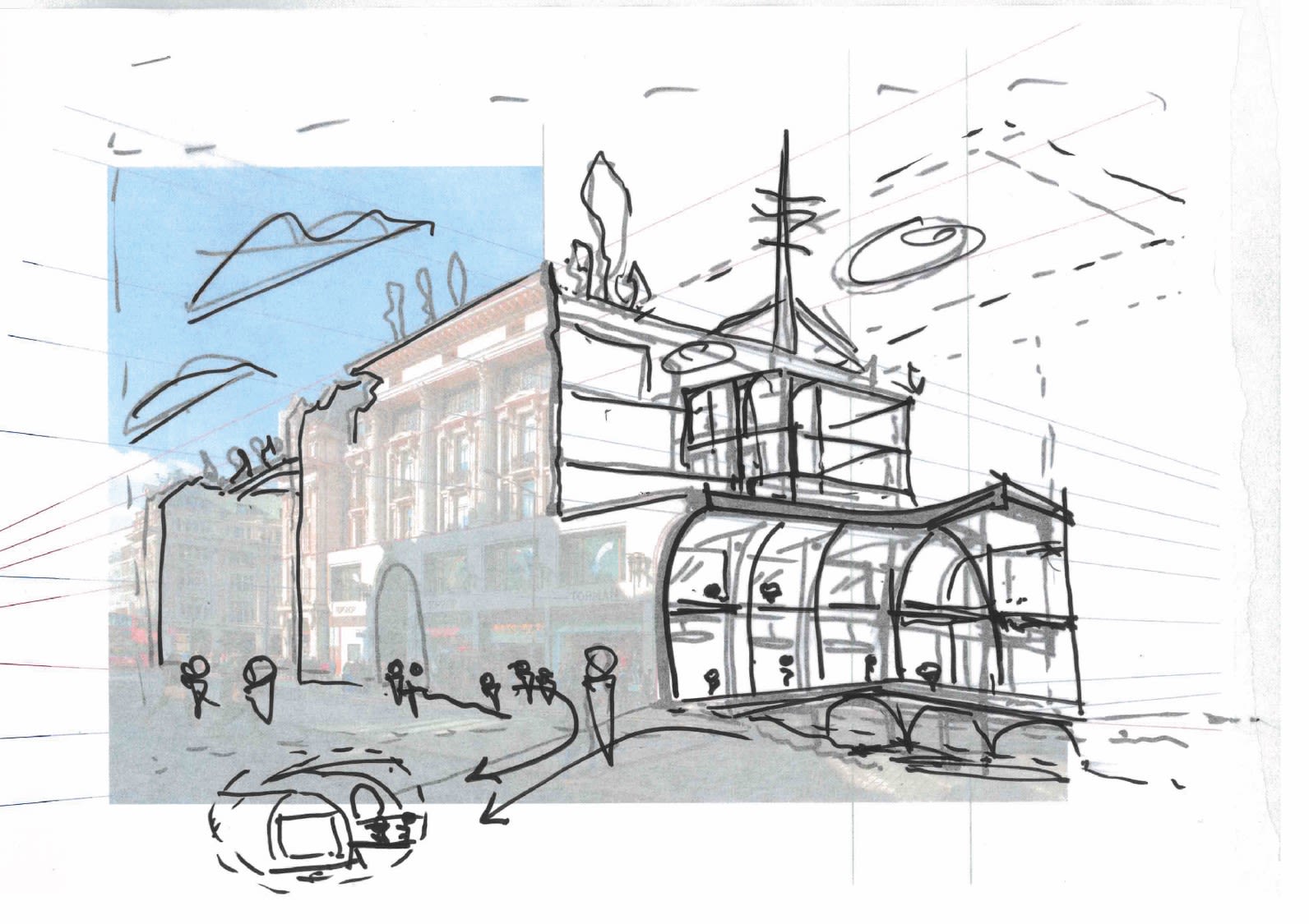
The second iteration takes a different viewpoint of the building, street level, because this is where the building is more recognisable. This sketch carries through many of the initial ideas but begins to work into these and of how the diagram can describe the interior space...
The third iteration starts to flesh out more of the key design ideas...
More detail is added as the diagram and ideas are worked through by hand...
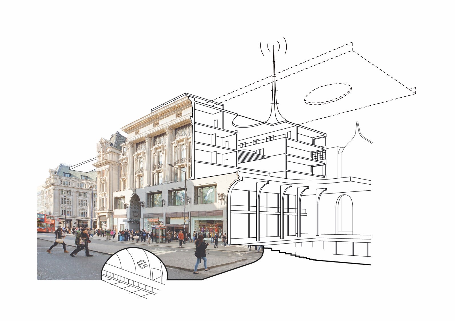
The diagram is digitally recreated, with the structure and key points taking shape but needing refinement...
The finished article shows the cutaway through the building, the key ideas and the architectural interventions that will transform the former flagship retail store into a new 'busy space' for the 21st Century.
